Restyling my personal website
I use my personal website for 3 reasons:
- To present myself away from social networks
- To have a place to write about my thoughts
- To have a place to keep a record of my public appearances related to tech - talks, podcasts etc.
One thing that has been bugging me ever since I started this website - circa 2019 - is that although I liked the look and feel of the website, I never enjoyed reading a blog post on it. There was something that put me off. And if it put me off, I imagine that it put others off too. This is what my website looked like:
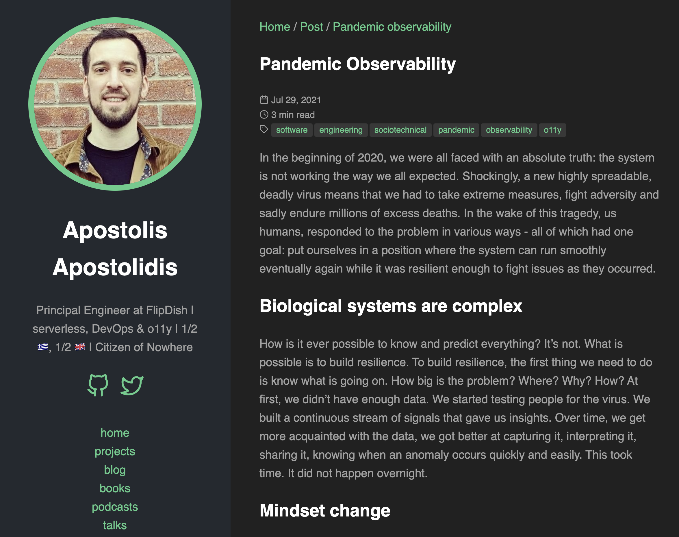 My old website at first glance sort of looks nice, no?
So what I ended up doing for a while is to decide to write on Medium. I liked the look and feel of Medium. It was clean, it was easy to read. But I didn’t like the idea of writing on a platform that I didn’t own (plus the paywall thing!). I wanted to own my content. I’d like to decide to publish there but I wanted it to be an option, not a necessity.
The only thing between me and a better reading experience was the style of my website. And what do we all dread to think when we think of styling? CSS. I’ve never taken the time to understand CSS properly. I’ve never needed to. But here we are. I needed to.
I decided to change that. I wanted to make it more readable, more enjoyable to read.
Enter ChatGPT
I use ChatGPT every day, multiple times a day. Using it to understand what I need to do with these CSS files, is a no-brainer.
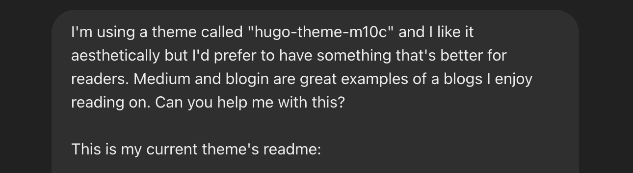 I started out with a question I’d like to ask a Designer
I won’t bore you with the details of how I used ChatGPT to help me with this. But I will tell you that it was a game-changer. I was able to understand what I needed to do, and - more importantly - I was able to do it.
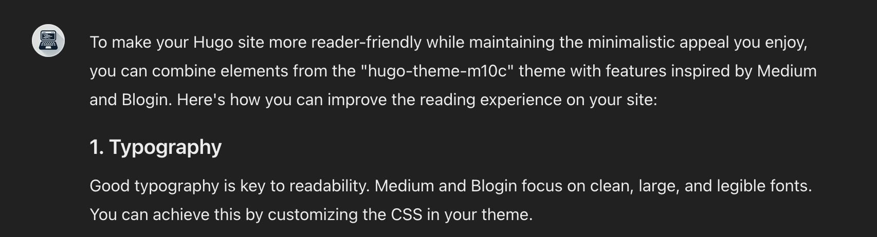 ChatGPT starting its advice really well
What I learnt
I learnt that CSS is not as scary as I thought it was. I’m happy with the way my website looks and reads now.
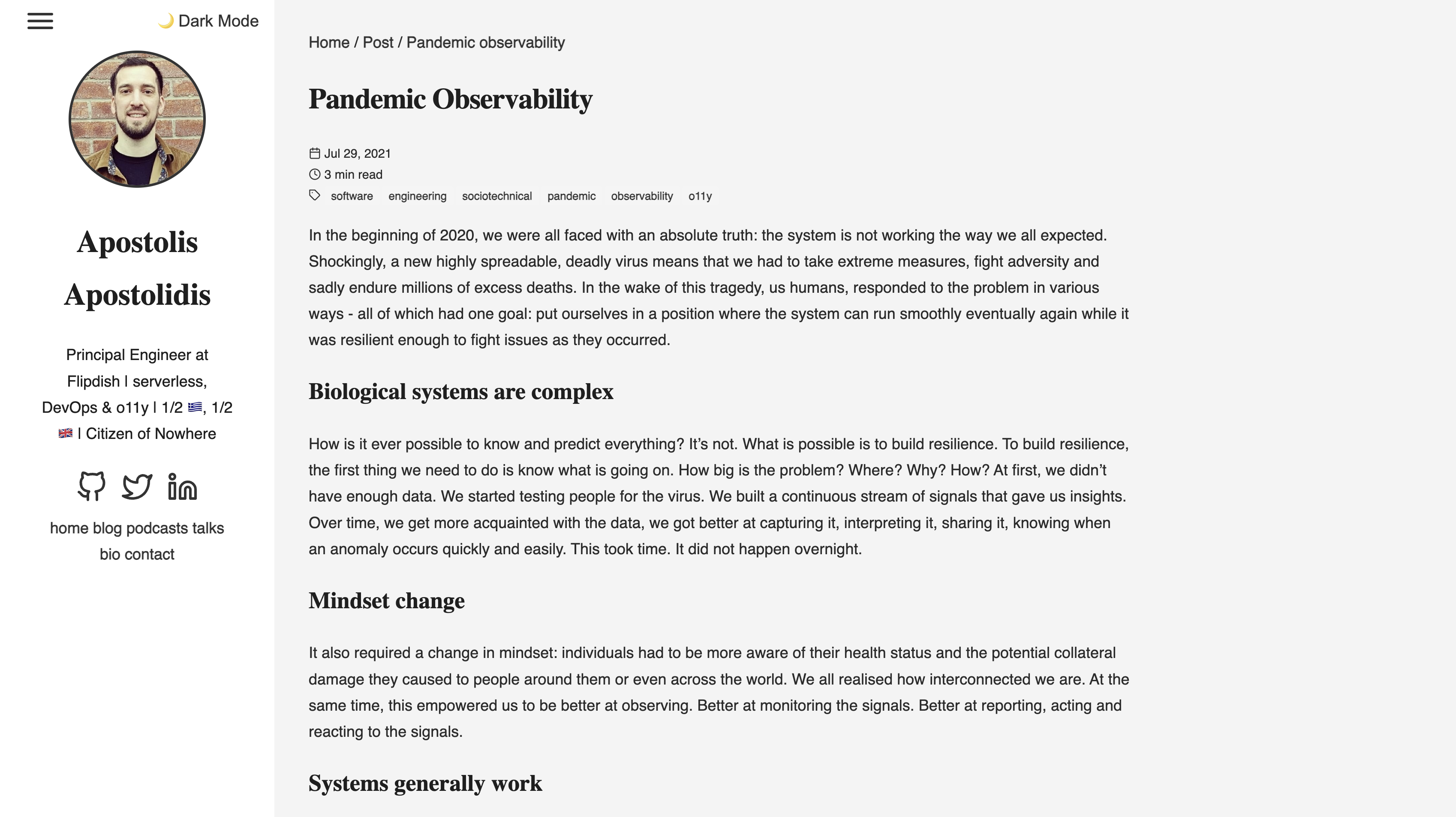 This looks so much cleaner and easier to read
And it looks great on mobile too 💥
 |
 |
|---|---|
| Mobile (light mode) | Mobile (dark mode) |
The detail
I made a few changes that contributed to this result but - from memory - these are the highlights:
- I changed the main theme to light mode: I thought I liked dark mode but actually what I really ever wanted is the choice to have light and dark mode and critically that the font colour and the background colour contrast well. I think I’ve achieved that.
- I changed the font to sans serif: I think is easier to read. I chose
Robotobecause I use it at work and I kinda like it. - I increased the font size: I think it’s easier to read now.
- I changed the font of all the titles: to
Merriweather. I think the font difference between title and body text looks nice. - I introduced a dark theme as option: I want to have the option to switch to dark mode when I wanted to. I enjoyed writing the javascript for this that essentially switches the theme by changing the class of the body
- I changed the layout of the blog posts: I think it’s easier to read now. I’ve increased the width of the text and I’ve added a bit of padding to the sides. I think it looks way nicer.
- I made my website accessible by default: it really is not that hard to make a website accessible. There’s tooling out there - chrome extensions (I used Site Improve Accessibility Checker) and Pa11y to get some results via a CLI. I may be missing some bits but now I have a feedback loop to make it better.
- I added a hamburger menu: I only did this for readability on mobile. I think it looks nice and it’s easy to use.
- I shifted left on formatting and spelling my content: I introduced tooling like markdownlint for formatting markdown files - the files that I use to write my blog posts. I also introduced cspell to check my spelling.
- I focused on the homepage: a homepage is the first page people typically see. I wanted to make sure that it was easy to navigate and that it was clear what I do. I’m still working on this but it’s a start!
 |
 |
|---|---|
| Home page (light mode) | Home page (dark mode) |
What’s next
I’m not sure! I’ve reached out to an amazing designer at work (hey Ryan 👋) to give me advice at this point. Because although ChatGPT has been useful, this is the point where a human with loads of experience can help me make the website even better.
I’m also considering moving the website to Cloudflare Pages. I’m currently hosting it on Amplify but I think I’d like to try something new. Plus, I got frustrated when I was trying to deploy my changes and Amplify would not deploy the latest changes due to a mismatch between the versions of Hugo used (on my laptop vs on their server). Cloudflare is an emerging tech platform that I want to learn more about so Cloudflare Pages make sense to me. I got it deployed in seconds to Cloudflare.
In the meantime, I have to confess, I browse to my website every so often just to look at it. 🙈